
Large Format Printing Explained: What Retailers Need to Know
Understanding vinyl banners, poster printing, and roll materials. Covers substrate options, color management, and practical specifications for retail printing projects.
Learn how strategic signage design attracts customers, communicates your brand, and transforms your retail presence into a powerful marketing tool.
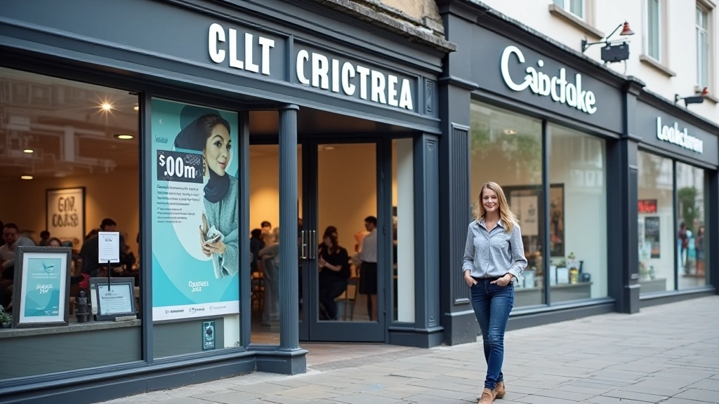
Your shopfront is your first impression. It's the difference between a customer walking past or stepping through your door. We're talking about that critical moment when someone's deciding whether you're worth their time.
Good signage isn't just decoration. It's your 24/7 salesperson. It communicates who you are, what you sell, and why someone should care. But here's the thing — most retail signage fails because it doesn't follow some basic design principles. Either it's too busy, too boring, or completely unclear.

Editorial Team
Written by the vestroholm Ltd editorial team, focused on honest, practical guidance for Irish trade print and signage supply.
Font choice makes or breaks your signage. You need typefaces that remain legible from 20 meters away, not just when someone's standing right in front. That means sans-serif fonts are typically your best bet for storefronts — they're cleaner, more modern, and easier to read at distance.
Font size matters too. We're not talking tiny. If people have to squint to read your shop name, you've already lost them. A good rule: test your signage design from the curb. If you can't read it comfortably from that distance, it's too small. Plus, don't mix too many typefaces. Two fonts maximum — one for your main heading, another for supporting text.
Kerning and spacing deserve attention. Tight, cramped lettering feels cheap. Generous spacing around text makes everything feel more professional and improves readability. It's a small detail that customers might not consciously notice, but they'll definitely feel the difference.

This article is educational and provides general guidance on shopfront signage design. Design outcomes depend on many factors including location, local regulations, and individual circumstances. Always consult with a professional designer or signage supplier to assess your specific needs and local requirements.
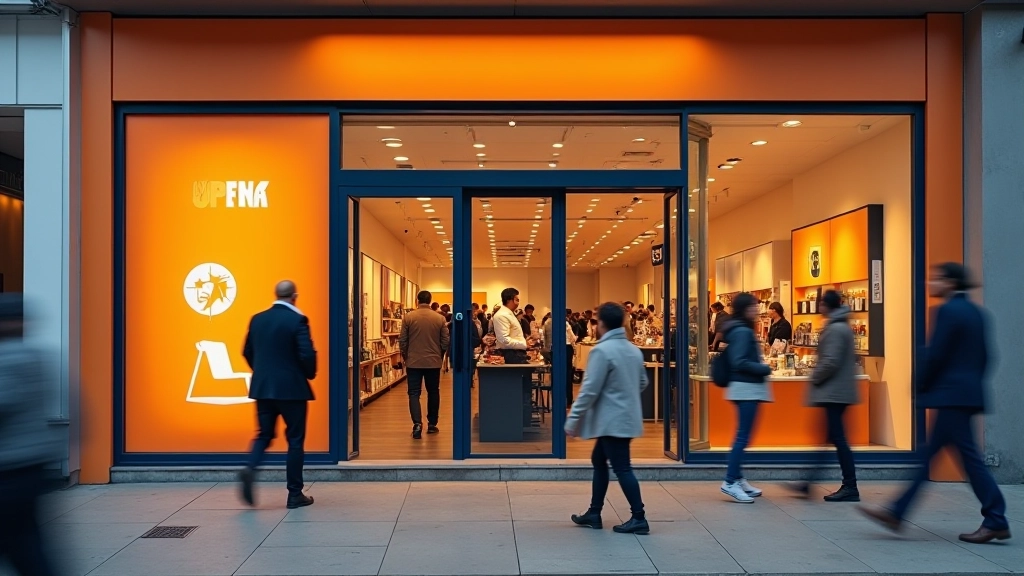
Color grabs attention. It's your fastest communication tool. But here's where most shops get it wrong — they choose colors they personally like instead of colors that work for their location and brand.
Consider contrast first. Your sign needs to stand out against the building, the street, and surrounding signage. If you're on a busy high street with lots of other shops, you need something bold. That doesn't mean neon necessarily — a deep color with bright accent text can be just as effective and more sophisticated.
Think about your customer base too. High-end boutiques work differently from convenience stores. Luxury brands often use refined color palettes — think soft blacks, golds, creams. Busy retail shops might go bolder. The colors should feel like they belong to your brand, not clash with it.
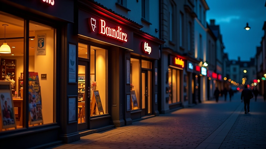
A beautiful sign that's invisible at night isn't beautiful at all. Lighting transforms your signage from daytime decoration to round-the-clock marketing. You've got options — spotlights, backlit panels, neon, LED strips. Each creates a different effect and serves different purposes.
LED lighting's become standard for good reason. It's energy-efficient, lasts longer than older technology, and you can control color and brightness precisely. Plus, LED allows you to create dynamic effects if you want — color changes, gentle pulsing, or steady illumination. But don't go crazy with effects. A steady, professional glow beats gimmicky flashing every time.
Warm light (around 3000K color temperature) feels welcoming and is flattering to most retail environments. Cool white light can feel clinical unless that's your aesthetic. The key is making sure your signage is visible without being harsh or creating glare that bothers neighbors or passing traffic.
Measure everything. Height, width, available depth. Check sight lines from different distances. Walk around at different times of day. Notice what other signs are nearby and what your building looks like. The best design for your space might not be the best design on paper.
What're you communicating? Your shop name, definitely. But what else? Your main product category? A tagline? A phone number? Keep it minimal. More information doesn't mean more customers. It usually means less impact.
Get mockups printed. Put them up. Live with them for a few days. See how they look in morning light, afternoon light, evening. Check how they appear from your most common approach angle. This step saves money and prevents regret.
What'll this sign look like in a year? Five years? Weathering, fading, dirt accumulation — they all matter. Materials matter. Some finishes hold up better than others. Budget for regular cleaning and occasional maintenance. A worn-out sign hurts your brand.
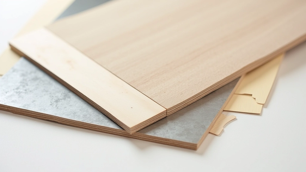
Material choice affects both durability and aesthetic. Vinyl's affordable and flexible — great for complex designs and color ranges. Metal — aluminum, steel, copper — conveys quality and durability. Wood works for certain brands but needs regular treatment to weather well. Acrylic can be elegant but yellows over time.
Think about your climate too. Ireland's wet. Materials need to handle moisture. Some finishes hold up better than others. That fancy paint job might look amazing initially but peel within two years if you haven't chosen wisely. It's worth spending a bit more upfront for materials that'll still look professional in year three.
Your shopfront signage is an investment. It's one of the first things people see, and it communicates what your shop is about before anyone even walks through the door. Getting it right means thinking about typography, color, lighting, materials, and how everything works in your specific location.
Don't rush the design process. Test ideas. Walk past them at different times of day. Get feedback from people who actually know your neighborhood. And don't skimp on quality. A well-designed sign that lasts five years is better than a cheap one you'll regret replacing after two.
Working with experienced designers and suppliers makes a real difference. They'll know what works, what doesn't, and why. They'll help you avoid mistakes that'll haunt you for years. Because once it's up there on your shopfront, everyone sees it. Make it count.
Understanding vinyl banners, poster printing, and roll materials. Covers substrate options, color management, and practical specifications for retail printing projects.

Compare paper stocks, vinyl options, and specialty substrates. Learn how material choices affect cost, durability, and the final appearance of your printed signage.

Get your files ready for professional printing. Learn about color modes, resolution requirements, bleeds, and formats that ensure your design prints perfectly.